Introducing Orb Contract-to-Cash: From signed deal to invoice in minutes
 Alvaro Morales
As Orb enters 2026, we’re marking a new chapter in our story with a new brand design. This evolution reflects the growth of our company, our customers, and the category we’re helping to define. In this post, we’ll walk through what’s changing, why it matters, and how it brings us closer to the people we serve.

“We’re not just refreshing our logo. We’re redefining how we show up in the world, with the clarity and confidence of a company that knows exactly who it’s here for.”
Internally, this redesign was called Mirrorball. The metaphor guiding this project was personal growth. Just like people move from childhood to adulthood, brands evolve too.
Orb’s earliest brand was like a toddler: full of potential and still finding its footing. Our last phase felt more like adolescence: experimenting, iterating, and learning who we are. Now, we’re stepping into a more mature phase, not because we’re done growing, but because we’re more self-aware, confident, and ready to lead.
Typography can be used as one of the most powerful signals a brand can send. Our previous type choices, geometric sans-serifs, felt modern and tech-forward, but they didn’t help us stand out. They also lacked the gravitas we wanted to convey as leaders in revenue architecture.
With our new design, we introduced a hybrid approach:
This trio reflects the duality of Orb: a technical platform with human values and a serious product that doesn’t take itself too seriously. To emphasize ideas, we now use Mondwest instead of italics or heavier weights, turning a typographic choice into a storytelling moment.
Our new palette is built around RGB—Red, Green, Blue—the primary colors in sub-pixels found in the screen you're viewing right now. It’s a subtle nod to Orb’s foundation in technology and its role as a platform that powers digital businesses. RGB isn’t just a palette; it’s a philosophy. We’re returning to the building blocks of digital design, just like Orb helps teams return to the fundamentals of revenue.
Each color plays a role:
While simple at first glance, this trio gives us rich expressive range when used in duotones and gradients, especially when paired with neutrals and soft textures.

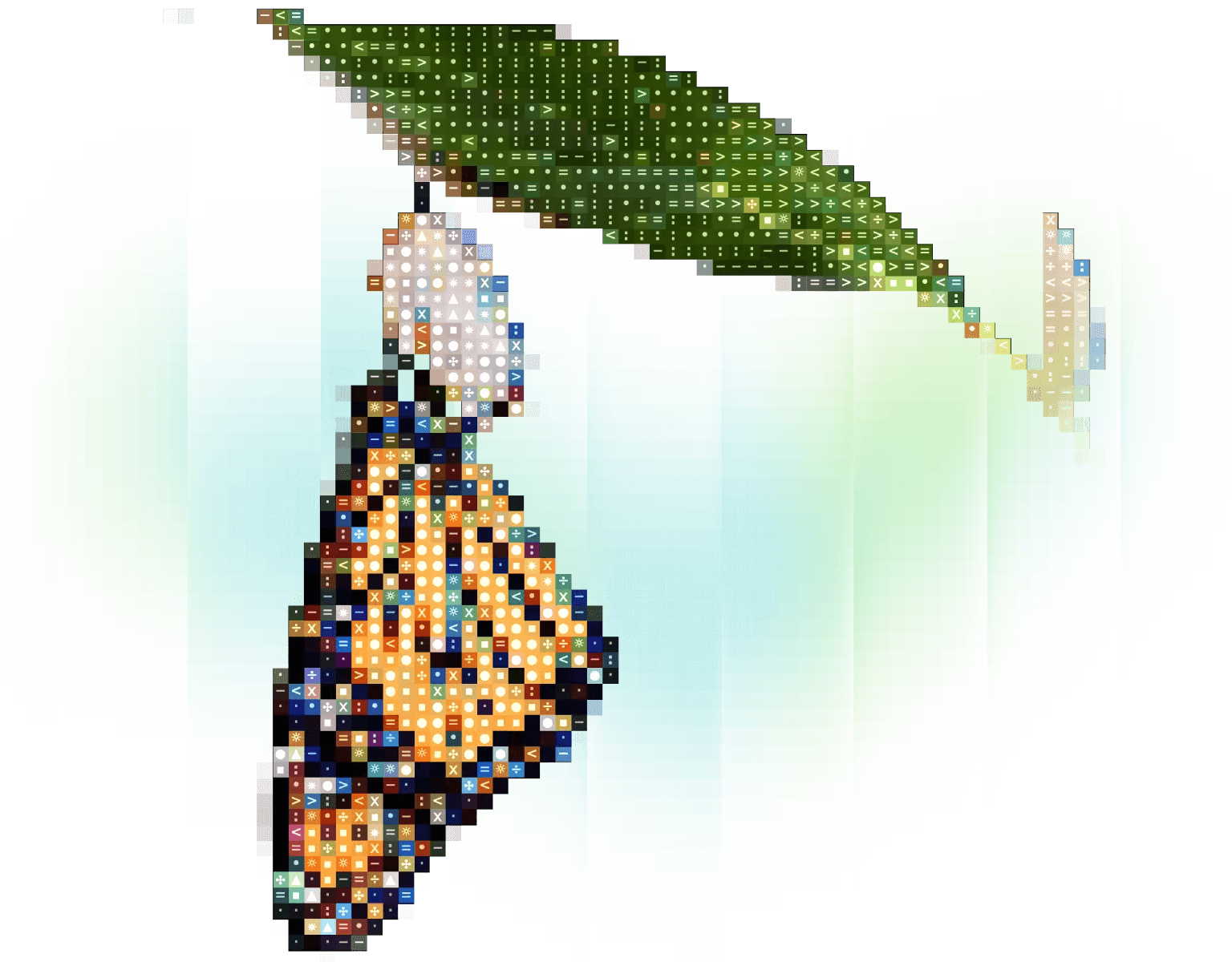
One of the key changes in this redesign was how we use textures and visuals. Our prior system used spheres and abstract textures meant to convey ideas like data and money. But without explanation, the meaning often got lost.
This time, the design is more intentional. We use:
Together, these create a system that feels both organic and technical, a perfect visual metaphor for Orb.

Orb has always been customer-obsessed. But until now, that wasn’t reflected visually.
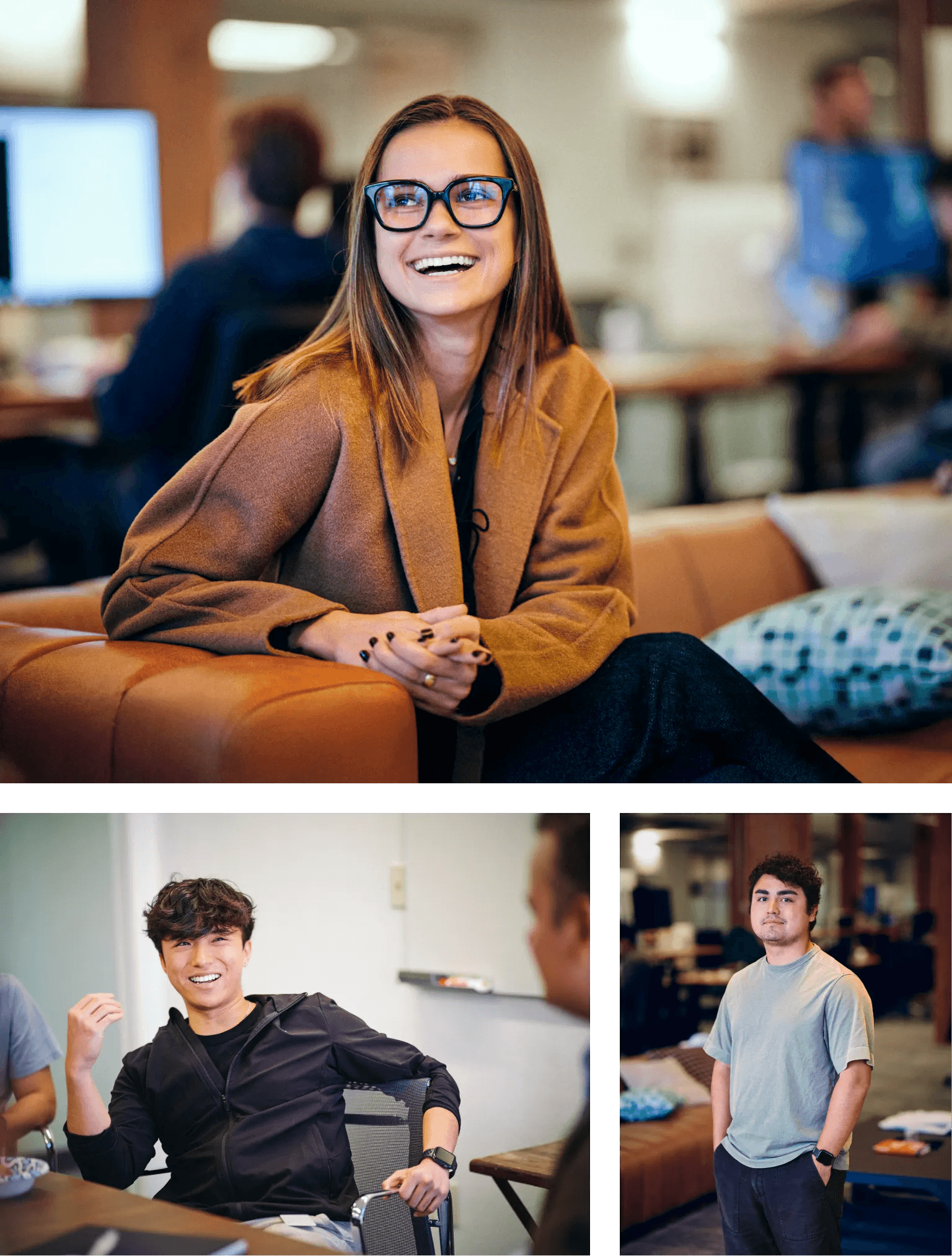
As part of the brand relaunch, we sent our design and content teams to photograph customers in their offices—candid, unpolished, and real. These images tell the true story of who we build for: revenue teams navigating change, product leaders solving hard problems, engineers scaling complex systems.
There are no stock photos, and no staged poses. It’s just the humans behind the data.

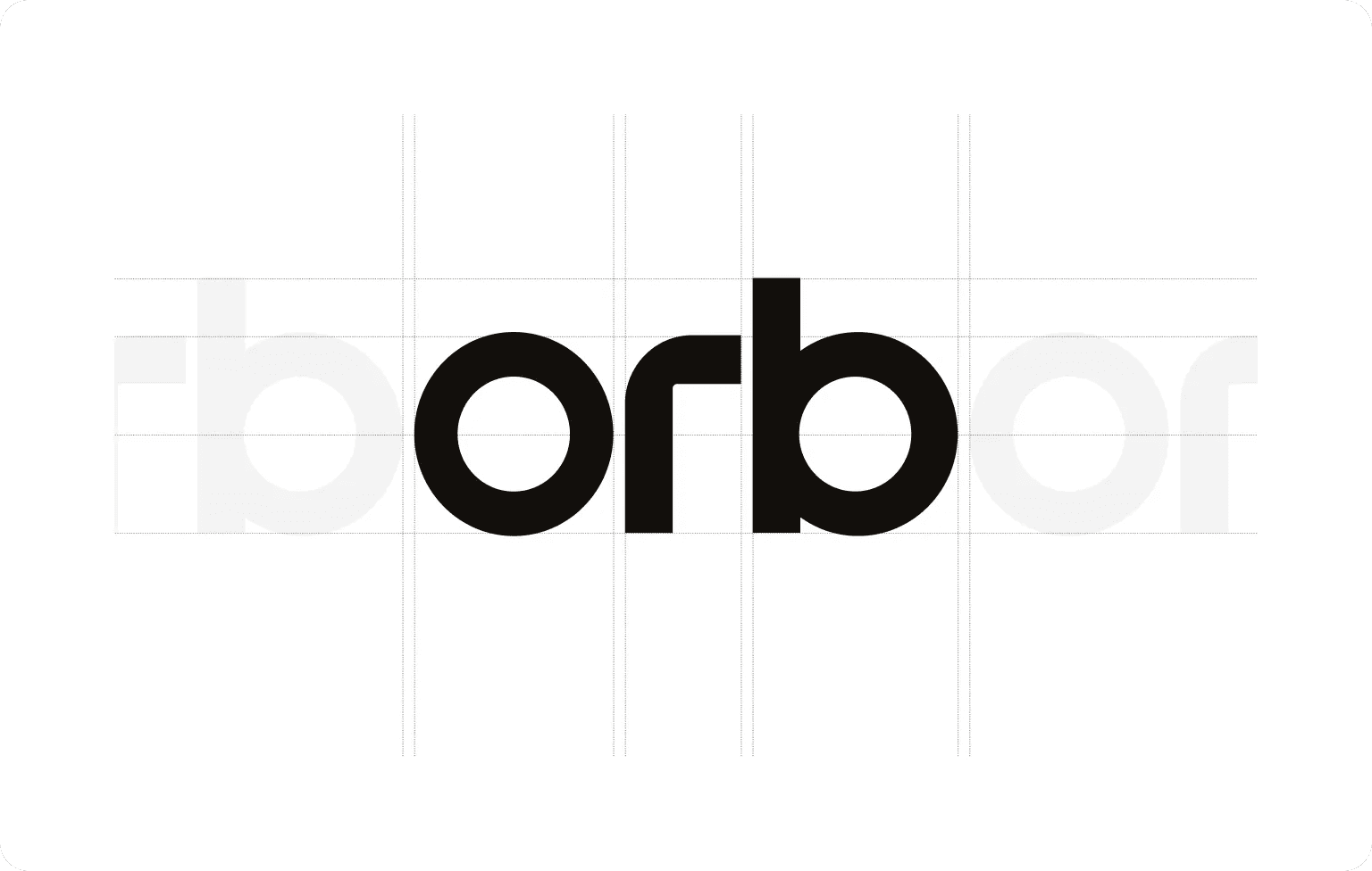
We’ve also redesigned our logo. Every curve and contour is intentional:
The result is clean, distinctive, and purpose-built, just like our platform.

Orb’s redesign reflects our position as a trusted partner to growth-stage SaaS and GenAI companies. As our customers scale, iterate, and evolve their pricing models, they need a platform and a brand that’s built to evolve with them.
Every detail of this redesign reinforces our core pillars:
This redesign was a true team effort and only made possible by Alvaro Morales, Bas de Goei, Daniel Millan, Ellen Perfect, Gio Wilentz, and the rest of the stellar team at Orb. Special thanks to branding agency, How & How for their guidance and for laying down the foundations for our vision; and to the amazing crew at Monogram for building our new site.
To our customers: thank you for letting us into your offices, sharing your stories, and appearing in our photos. This brand is a reflection of you, too.
As we roll out our new visual identity across the website and product, we’ll continue iterating. Like Orb itself, our brand is designed to evolve because design is a living system.
See how AI companies are removing the friction from invoicing, billing and revenue.